|
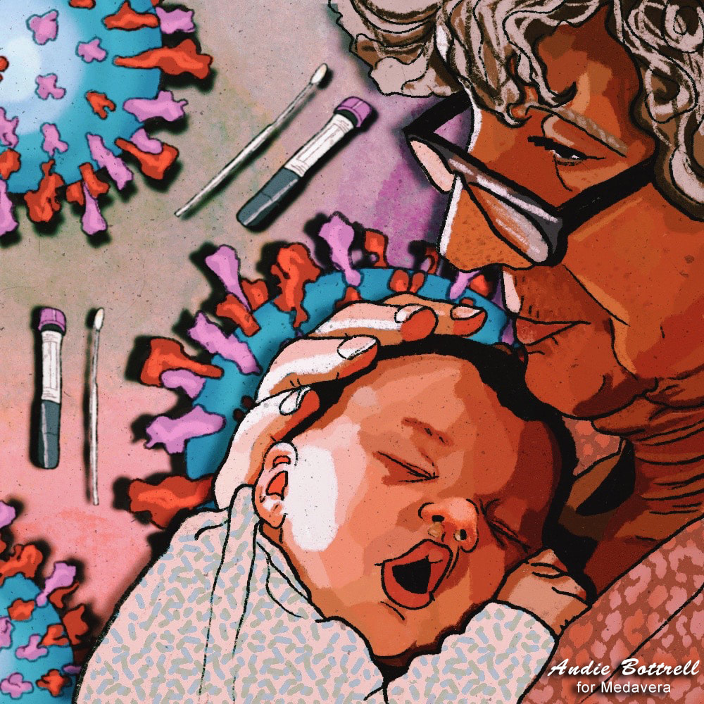
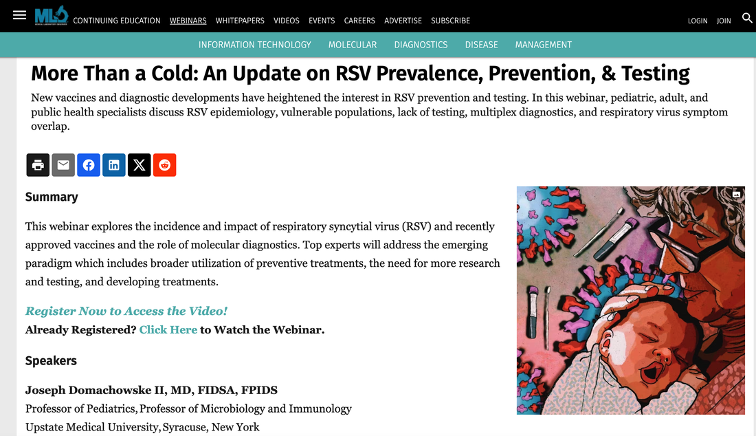
June 2024 Update: Proud to announce that this illustration was a Gold Award Aster Award Winner! The Aster Awards is the nation's most elite competition dedicated to recognizing the most talented healthcare marketing professionals for outstanding excellence in advertising, marketing and communications. Recently, I have been staying booked and busy with all kinds of graphic design and illustration work. This has been nice because it's been freezing outside, so staying in and working by the fireplace while sipping coffee, pups at my feet, warm blankets all around me....well, it's a Taurus Dream! There has been postcards, banners and newsletter designs for the Springfield Art Museum, logos and branding for a new company, newsletter design with playlist creation and writing for a friend's incredible lamp company, and a slew of medical illustrations for Medavera. When I was younger and pursuing a career in acting, my dream job was to play a doctor on a successful, long running tv show like Grey's Anatomy. While I never got there - I did get to play a "holistic healer" on an episode of I Didn't Know I Was Pregnant (lol). Then, I got a job writing plastic surgery blogs which I did for 9 years until my boss was arrested for hiring a hit man to kill a former employee. Anyway, all this to say, from growing up as the daughter of a Pharmacist, to being a candy stripe hospital volunteer, to my own searches to figure out answers for my chronic health issues...the medical field has never been far from view. So, I love that I can now use my illustration skills to contribute to the medical field. For this project, the client needed an illustration to promote their Webinar on RSV. They had a quick turnaround, so we didn't start with a sketches or have multiple rounds of revisions. It was a 2 day turnaround. The image was to include RSV bacteria, testing materials, and the two most vulnerable subjects for RSV. This is what I came up with. What do you think? If you are in need of illustrations for your business, don't hesitate to reach out!
Call or Text: 417-848-0932 Email: [email protected]
0 Comments
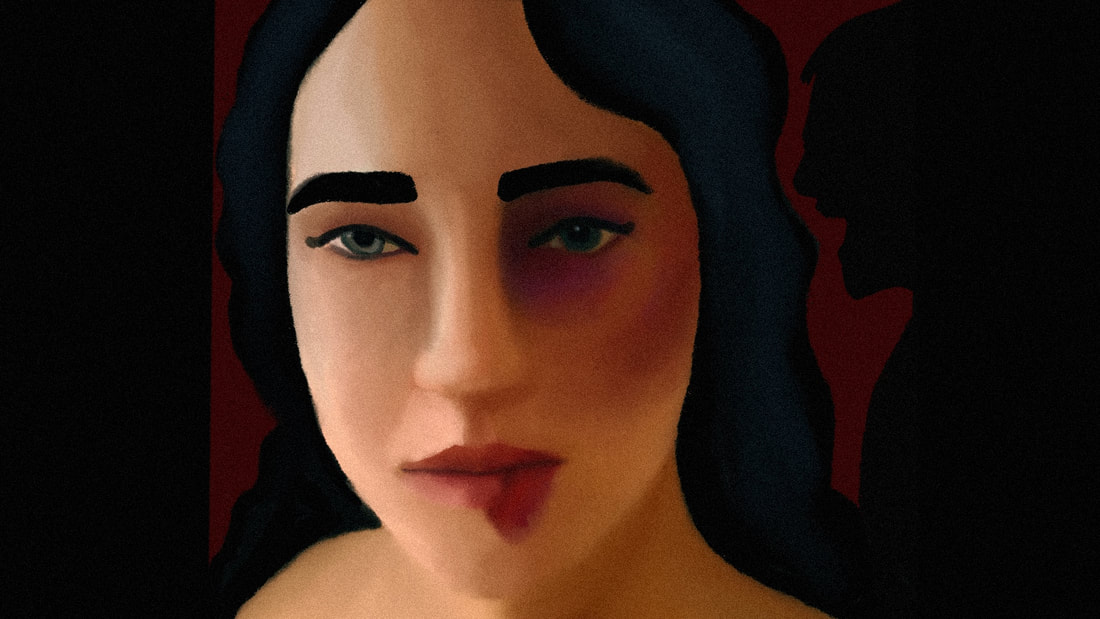
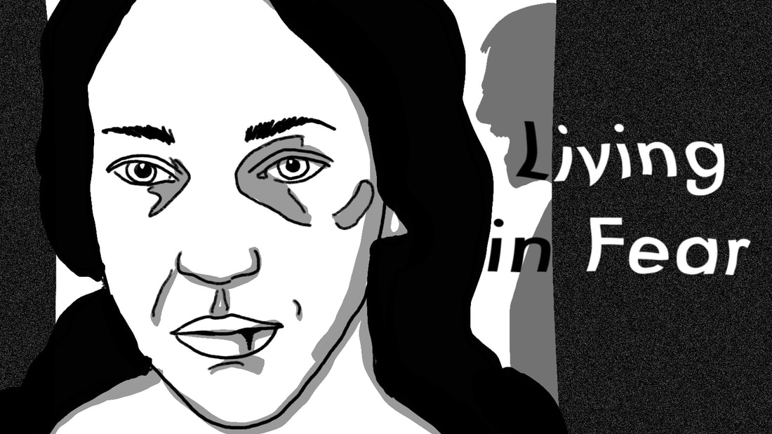
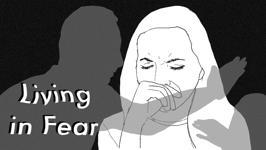
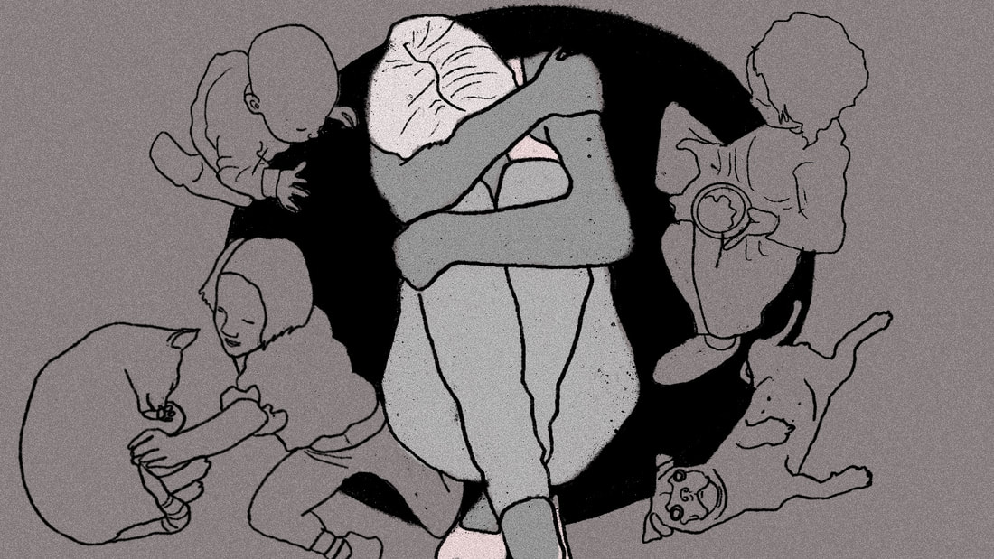
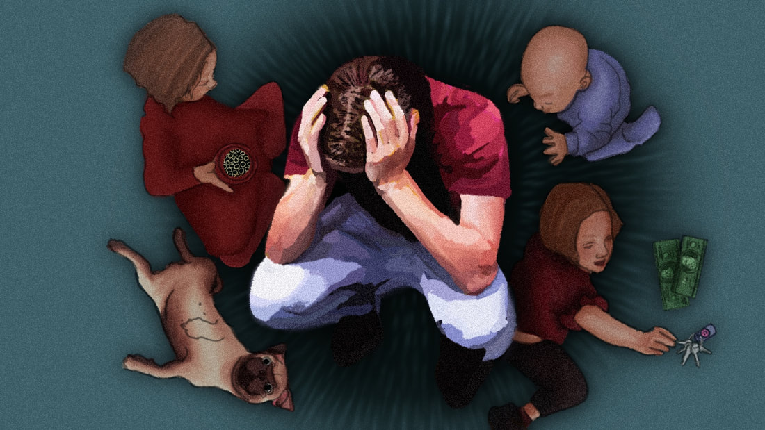
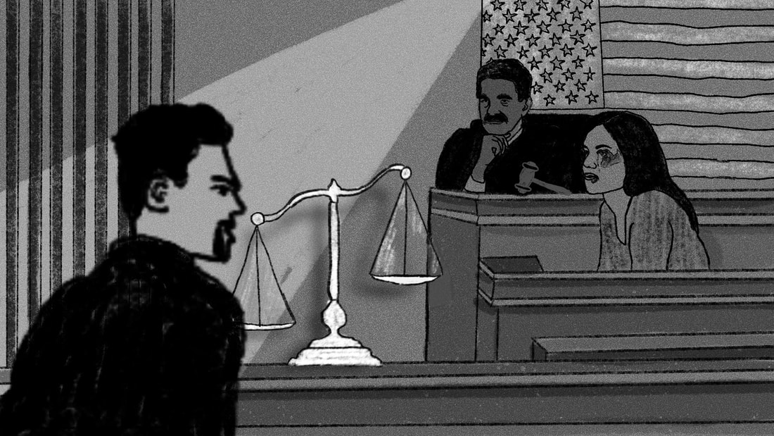
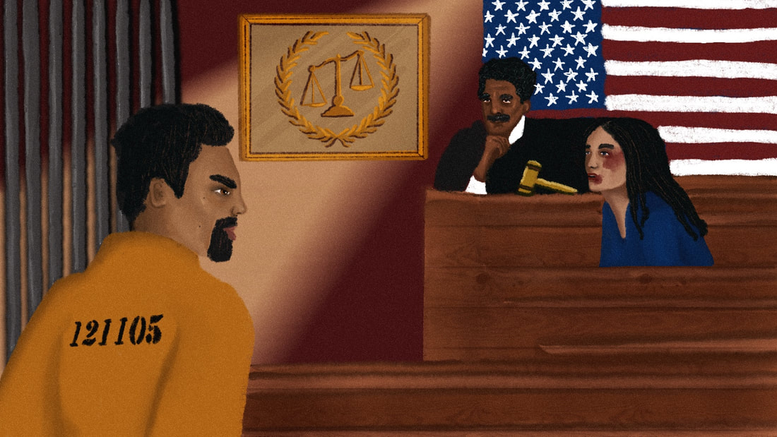
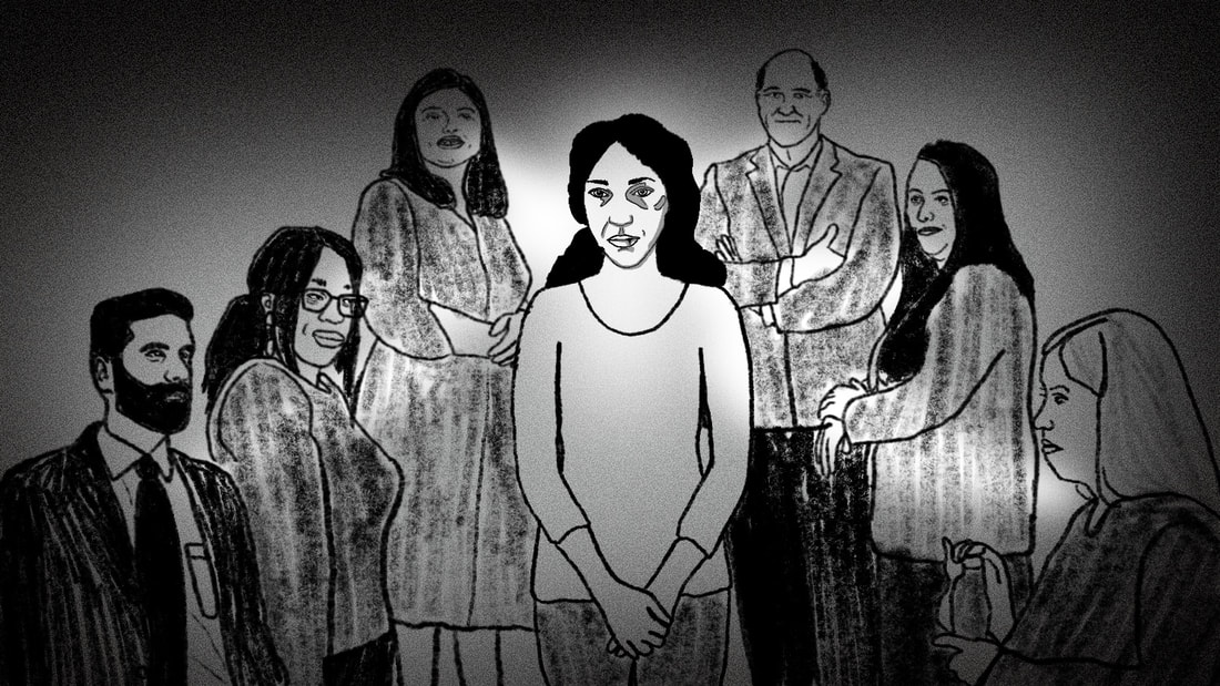
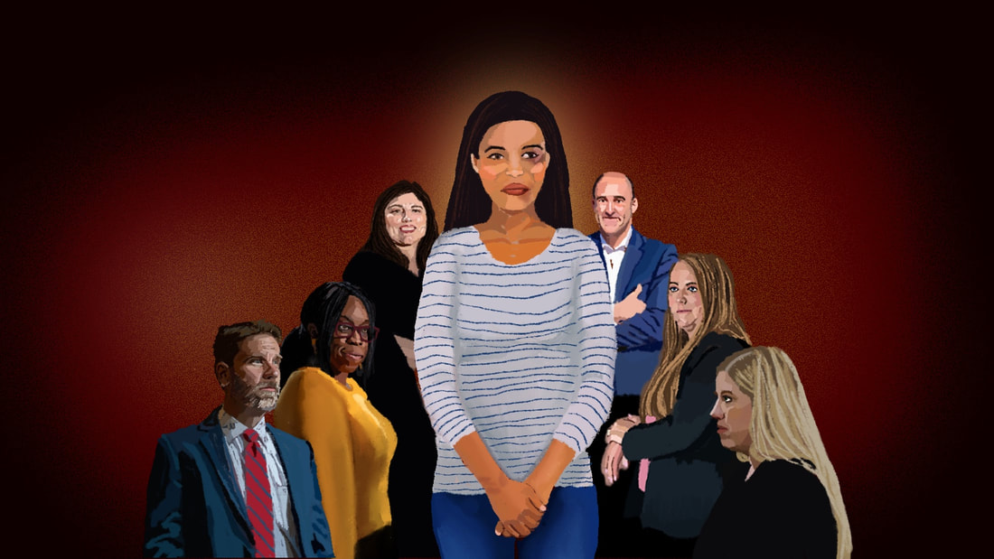
I was honored when the Springfield Daily Citizen reached out to ask me to do editorial illustrations for a 4 part series on Domestic Violence in Springfield, MO. My first job with them was earlier this year when I illustrated a story they did on working from home. In this blog, I'll take you behind the scenes of my editorial illustration process for this Springfield Daily Citizen job. For the first illustration, they wanted to subject featured and wanted to be able to have a version with the title of the series "Living in Fear" and without, as well as a version they could use as the logo for the series. Below are my first two mock-up sketches for the concept based on their requests, and above is the final version in full color. Some time after creating this illustration, I nearly spat out my water as I was driving home from a doctor's appointment and saw my illustration on a billboard! Pretty cool--unfortunately, I wasn't quick enough to get a picture of it. The second illustration in this series was intended to illustrate the things most women in domestic violence situations feel make it harder for them to leave: kids and pets. In this illustration, we see our main character in a dark whole or pit with their cherished loved ones, the kids and the pets, surrounding them--money and keys also appearing signifying the opportunity (or lack thereof) to flee. The sketch of the main character appears more feminine presenting, but the newspaper requested a more gender neutral character for this one, as men, women, and non-binary individuals may all be the victim of domestic violence. The third illustration in this series was to depict the ways the justice system in America is often bent towards the perpetrator and against the victim, thereby re-victimizing and further traumatizing the victim. For this, we see a court scene with the scales of justice leaning in favor towards the perpetrator, while the victim takes the stand. In the final illustration in this series, the newspaper requested we see all the people who are in the victim's corner, helping them to safety, to heal, to get justice, and shine a light on what has been happening in the shadows and behind closed doors. Each of the people surrounding our main character here are actual, real local people in Springfield, MO who work to help victims of domestic abuse. Check out the incredible reporting done for this series Living in Fear by the Springfield Daily Citizen.
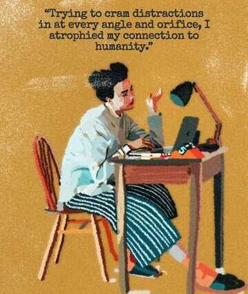
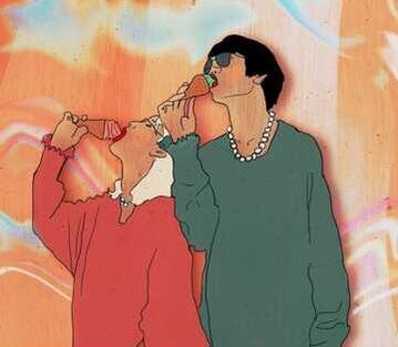
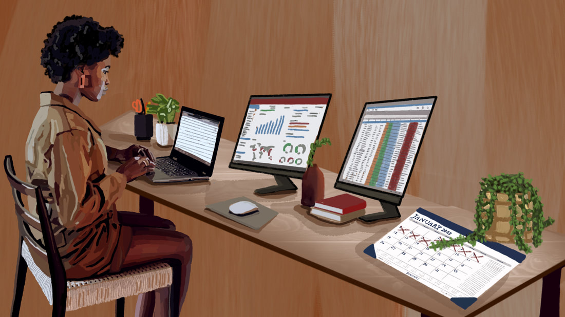
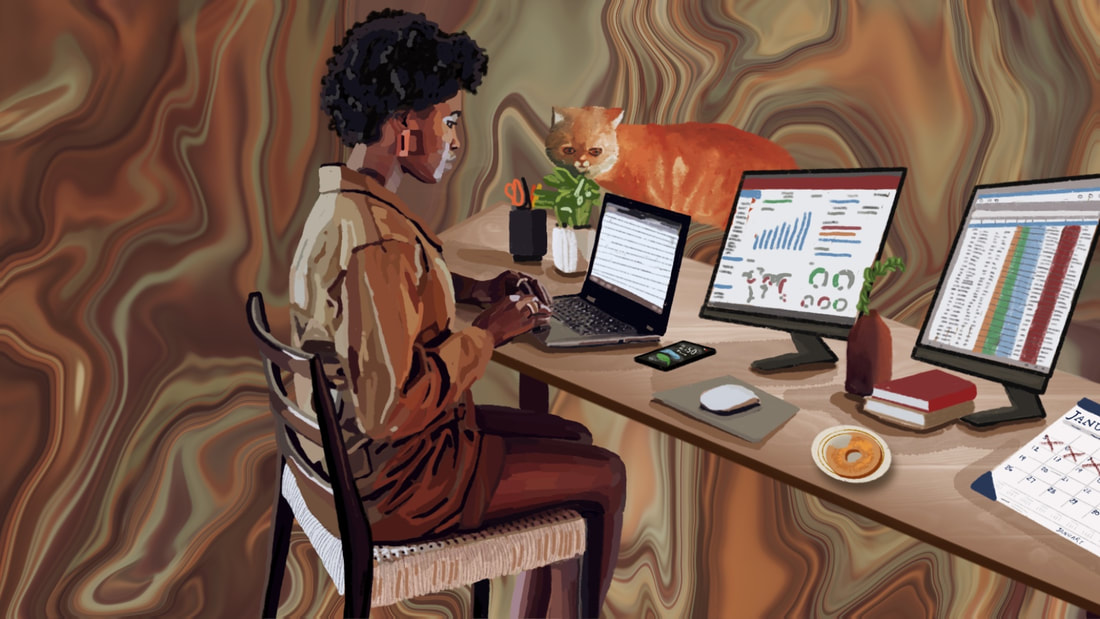
If you are looking for editorial illustrations to help bring your story to live, or custom illustrations to give as a gift, don't hesitate to reach out! Call or Text: 417-848-0932 Email: [email protected] When Shannon reached out to me to create a Custom Illustration for the Publication Springfield Daily Citizen, she started off by referencing two previous illustrations of mine and pointing out the aspects she liked. She said she needed a custom illustration for an article they were working on about 'working from home' and they wanted to show a woman working from home at a desk with multiple screens and a calendar with dates marked off. She liked the way I had illustrated the person in this first image below on the left and she liked the background of the second image below on the right. She also said she had a quick turnaround time--she would need the image less than a week later. I said that was no problem and had a few clarifying questions like: 1. Is there any preference on the type of person (age, gender, size, ethnicity, type of work)? 2. What type of content should be on the screens or should what's on the screens not be detailed enough to be able to distinguish? 3. Should the calendar be on the wall, on one of the screens, on the desk? And what month should show? 4. Any color preferences? Once she got back to me with her reply, I got started and this was the first draft I sent over a few days later: She liked this version but felt like it wasn't clear enough that she was working from home--she wanted to see more details that made it feel like she was working from home. She also wanted the subject to be moved more to the center so when they share it on social media it wont crop the subject off. Lastly, she thought the background could have more abstract "pizzaz" like the image she had sent. I felt like with this feedback I could go one of two directions, so I went ahead and created both of those options for them to choose from. One which filled in the background with a room in a home and one which added just a few more "home" detail hints on the desk but had a more abstractly "pizzaz" background. Which do you prefer? As I'm sure you guess from the header image on this blog, the option with the more detailed room in the background won from the client's perspective.
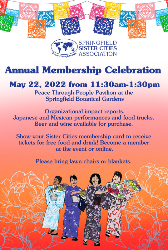
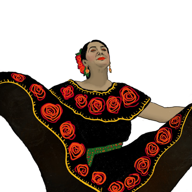
Check out the article here! If you are in need of a custom illustration, don't hesitate to reach out! Call or Text: 417-848-0932 Email: [email protected] After shooting the Sister Cities Kite & Pinata Festival event, I was inspired to do some illustrations of the photos I took, including the illustration below. When Sister Cities saw that illustration, they reached out to me to create a flyer and postcard for their upcoming Annual Membership Celebration with some more custom illustrations of the performers at the event. The illustration below didn't end up making it onto the final design because they weren't going to be able to perform. In the end, the above was the final design of the flyer and then there was a slightly varied version of it for the postcard design. If you are looking for a graphic designer and illustrator to create marketing content for your upcoming event, don't hesitate to reach out!
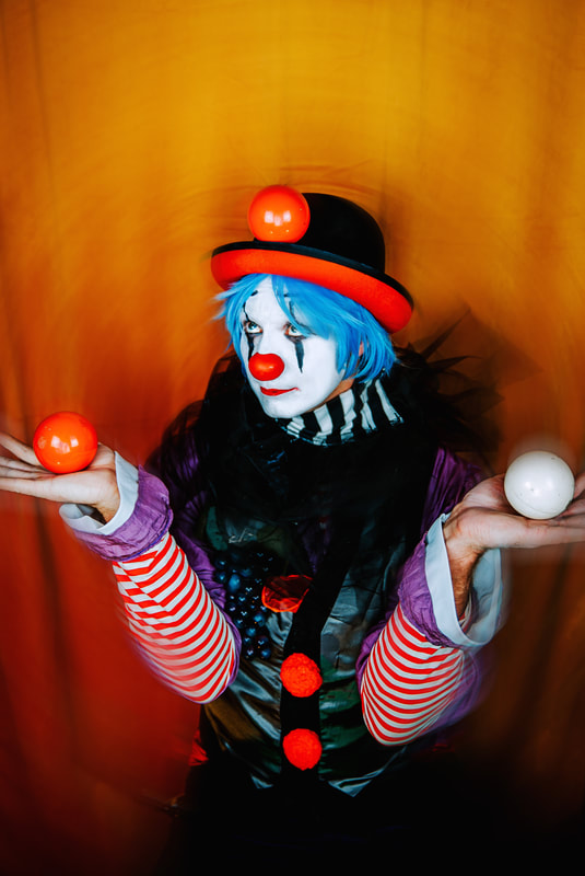
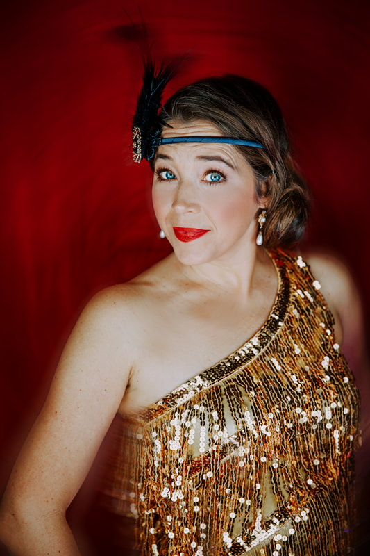
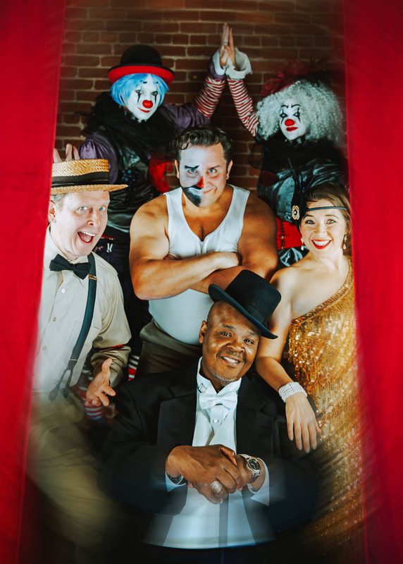
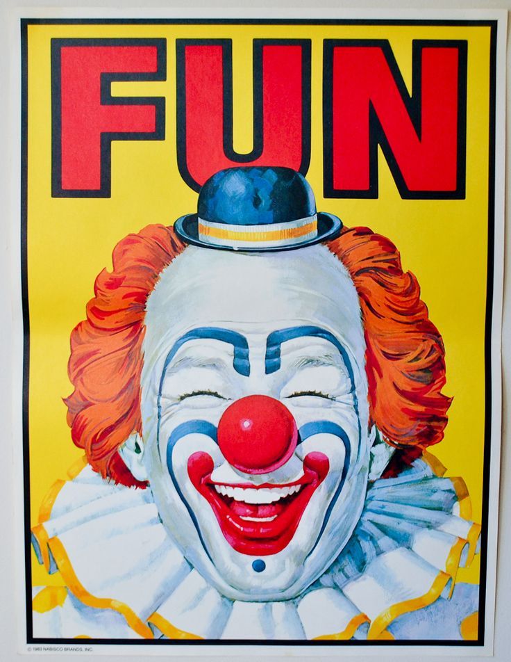
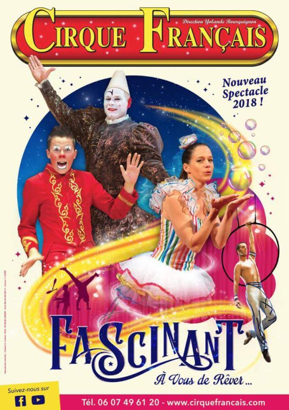
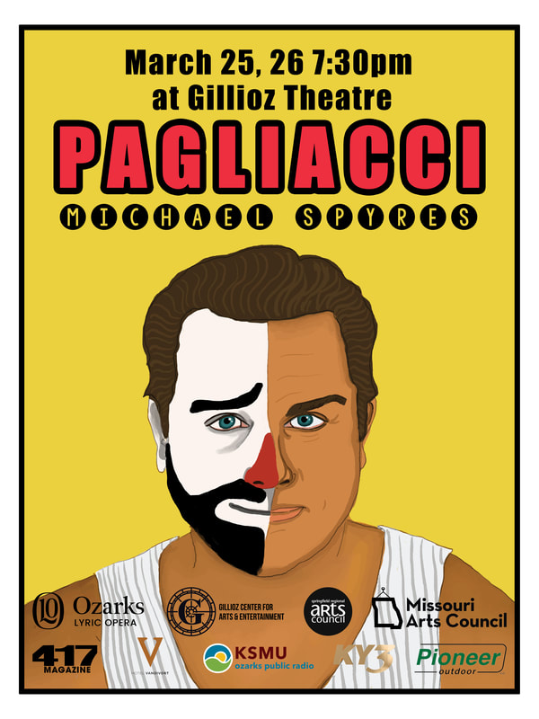
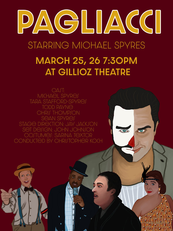
Call or text: 417-848-0932 Email: [email protected] When Sean and Michael Spyres reached out to me to take promo photos and create the poster for Ozark Lyric Opera's production of Pagliacci, I was super excited. Their take on Pagliacci is so refreshing and inspiring and I knew we would have a lot of fun collaborating on this. They wanted to pull in ideas from lots of vintage circus inspiration. How could it not be fun? We took group and individual portraits of everyone with two backdrop options (Gold and Red velvet curtains). It was a lot of fun seeing these performers getting into character throughout their photoshoots. Plus, the costumes were...I mean, just look! For the poster, Michael wanted to pull from old school circus imagery (see below for 2 examples he sent me)...and I went in and illustrated some of the photos I took to create both photo and illustrated poster options. The final two posters they decided on were both illustrated posters. See below! If you need promo photos or posters for an upcoming production, play, concert, film, etc. Shoot me a message at [email protected] or text or call 417-848-0932.
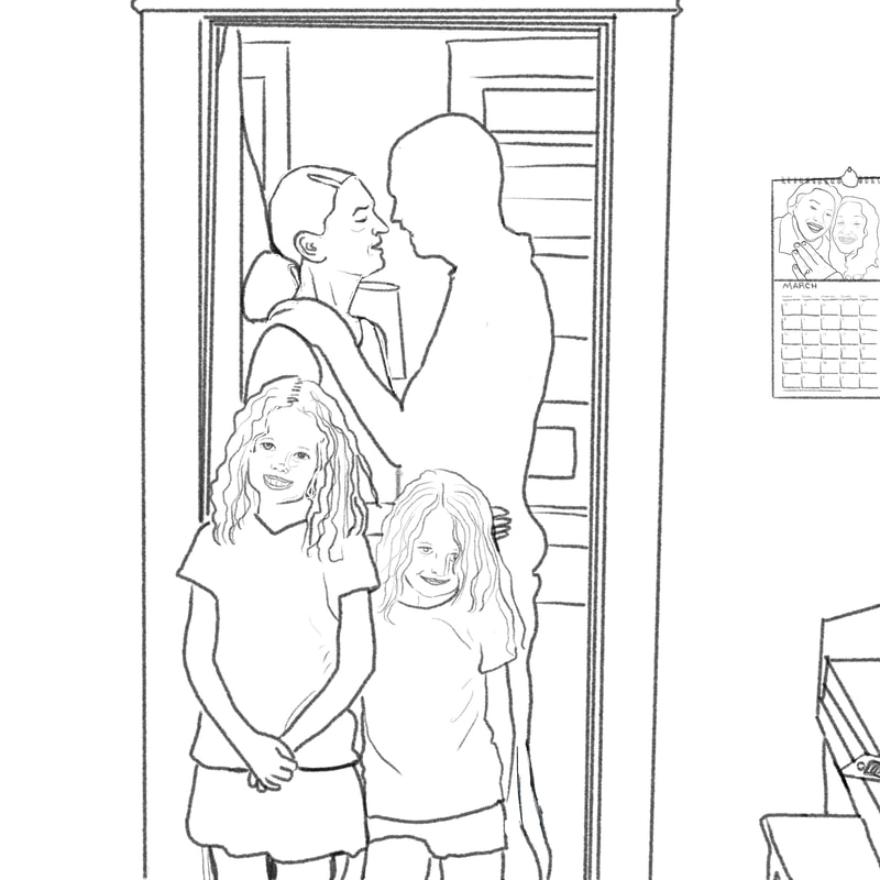
And don't forget to get your tickets now for Pagliacci at The Gilloiz later this month! Recently, I was nominated and chosen to create a piece of artwork for Commerce Bank's "What Matters Most" campaign. They believe that art can help remind us of what matters most--and I whole-heartedly agree! More from Commerce Bank about this campaign: "Since our founding, Commerce Bank has had a long tradition of supporting the arts. We believe the human connection, inspired through art, is just as important as any financial matter. Life is complex and can be both beautiful and challenging. We are committed to helping people do what they're dreaming of and take care of the things they love." They asked 8 artists to consider what matters most to us and how our priorities have changed through the pandemic. They asked us to consider what lifts us up, what inspires us, what keeps us going, what matters most and to translate this into a piece of artwork for an online exhibition. As a reference photo I used a portrait of a family I took during the first few months of Covid when I was offering "Porch Portraits" as a way to capture families and individuals living through this strange time. I took this photo of a family through the glass in their front door. I loved the way the parents were lost in each other's embrace and the kids were excited to have an audience. I think this last year our collective priorities have shifted--our loved ones becoming even more important, taking care of ourselves and each other becoming priority one. This last year was marked by loss--by loss of loved ones, loss of jobs, loss of financial security, loss of social life, loss of major events and celebrations in the traditional way. I wanted to represent that loss--one of the parents in this embrace is blacked out with a galaxy of stars inside to represent the losses we experienced. In the calendar to the right, a happy couple (actually myself and my fiancé) are shown showing off an engagement ring...on the calendar itself is written in various events: wedding, funeral, birthday, no school, dentist, doctor... to include all the ways this last year made us change our approach, postpone, or cancel every event that peppers our daily lives. In the far right, you'll see the edge of a piano, on top of which sits an iPhone... an homage to the ways the arts carried us through this time (by indulging in music, learning a new hobby, watching a TV show, reading a book), and the way technology kept us tethered together while far apart. Here's the final artwork. I love how it turned out and how every detail has meaning. A special thanks to Caron Settle Parnell and her family for allowing me to use my photo of them as a reference point for this piece. If you're interested in purchasing any digital downloads or prints of my artwork, or in commissioning me to create a piece of custom artwork for you or your business, smash that email button below to shoot me an email (DesigningIndie@gmail(dot)com). I'm a friendly, fast, sure-thing when it comes responding to emails. I have no tolerance for notifications left unattended! If you prefer to call, I've made a button just for you. Do you feel special? You should. In this digital age, you're a magical, rebellious unicorn of vocal correspondence.
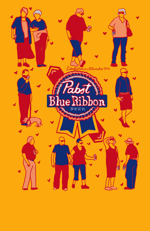
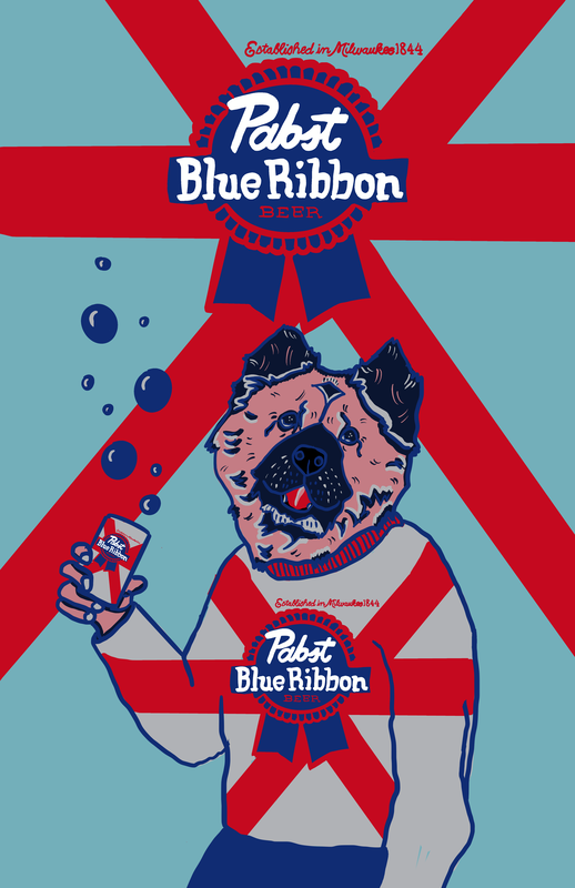
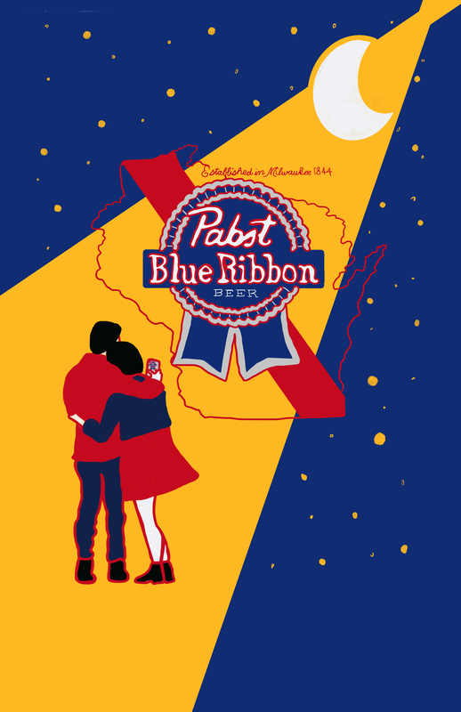
I found out about the PBR Can Art Contest for the first time this year. What a cool opportunity! The winner is put on cans and gets $10,000! Plus, they commission work from all the top 25 artists. I didn't make the top 25 this year, but I had a lot of fun creating these nonetheless and wanted to share. It's not all about the destination after all…it's about finding joy in the journey. At least, that's what an embroidered pillow once told me. The biggest shame of all is that Olive's head on my body wont be reppin' the PBR brand. That golden girl deserves national recognition. Anyhoozzle. There's always next year! If you like what you see, contact me to create illustration magic for your business or as a gift to yourself or your loved ones. I create logos, brochures, custom illustrations, portraits, and so much more!
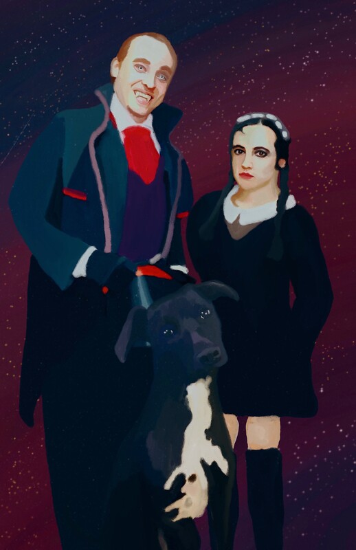
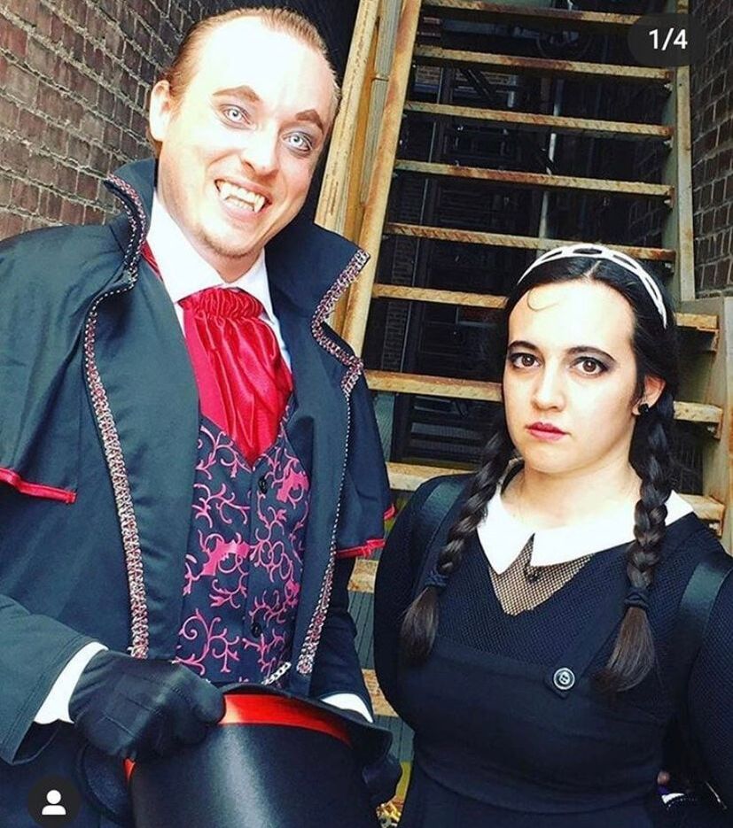
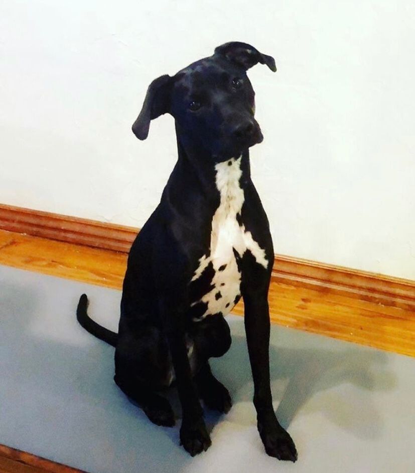
Okay, love you, bye! I mean, bye! Eli reached out to me about creating a custom illustration as an anniversary gift and since their anniversary happens to be on Halloween he wanted them to be in costume. Also, I had to find a way include their adorable pooch! This custom illustration was created on Procreate on an iPad with an Apple Pencil. I used the dry ink brush to illustrate the lovebirds and the dog, and I used various paint brushes to create the background. I loved doing this spooky, special family portrait illustration. Join me in wishing the couple a very happy anniversary and many more years of love together! Custom illustrations make terrific gifts for all occasions! If you are interested in ordering a custom illustration, shoot me a message!
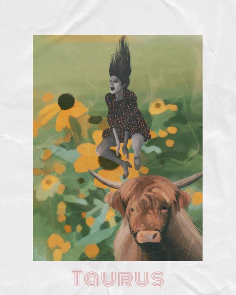
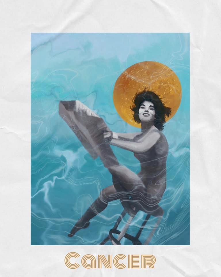
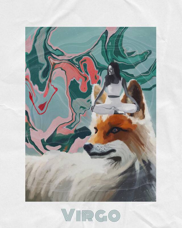
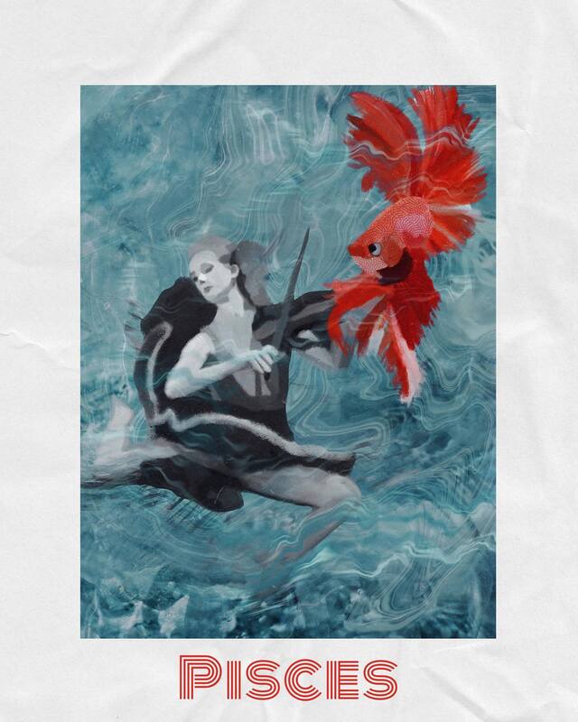
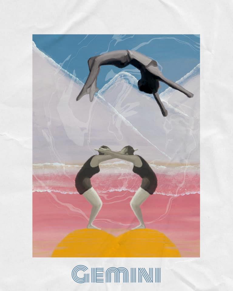
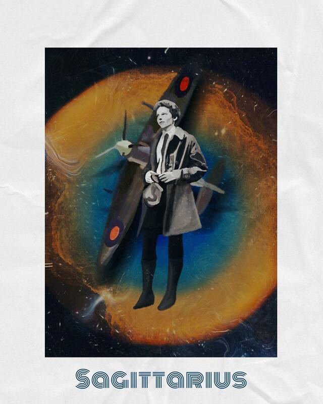
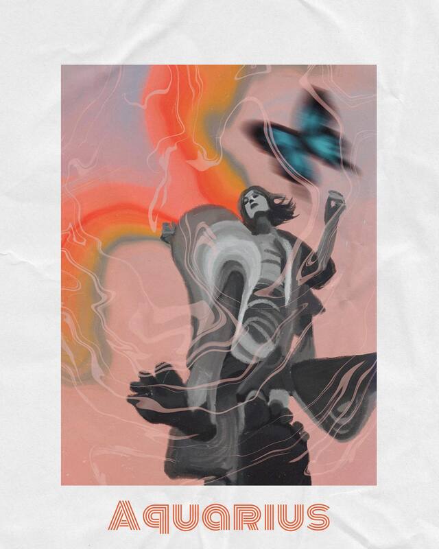
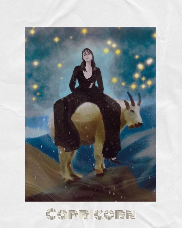
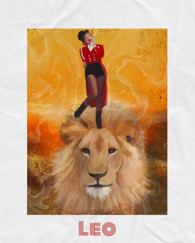
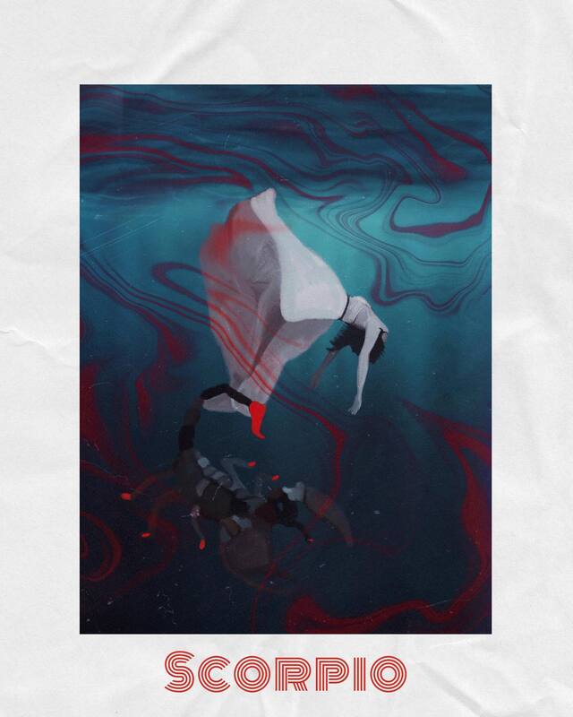
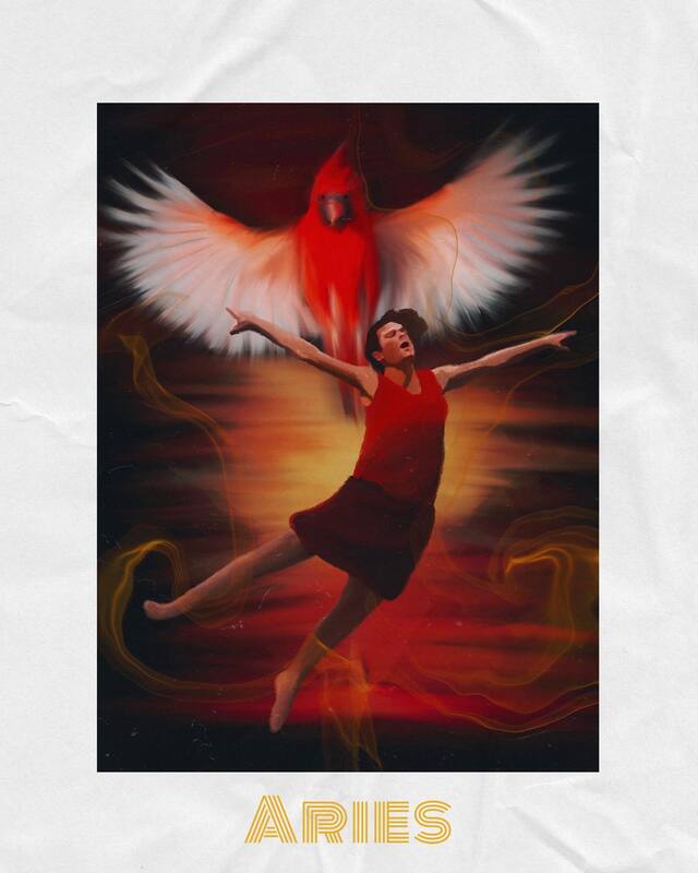
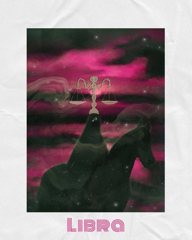
When I was in my early twenties, I lived in Los Angeles and was working as a background actor in movies and TV shows. On one of those sets is where I first heard my friend Anthony casually and with great authority break down the various zodiac signs and guess with great accuracy our signs. I was fascinated. I didn't "believe" any of it, but I enjoyed it with a speculative interest. Over the years, I pretty much stayed in that state of quiet curiosity, checking my horoscope periodically for a laugh. Then, a few years ago, I started checking the romantic compatibility between signs for people I dated, and people who friends were dating and I started to notice a lot of accuracy. My girlfriend and I are Cancer and Taurus respectively and everything I've read about the match between these two signs is exactly, for us, right on. We are extremely compatible. A great match. And my previous relationships (before I was checking astrology compatibility) ended up ending due to exactly the kinds of issues astrology says those two signs matched up would have. It's crazy! And hey, I still take it all with a large grain of salt, and I'm not going to make any decisions based solely off astrology, but I do enjoy it as a fun lens to look at things through and a perspective to consider. I've been wanting to do a zodiac sign illustration series for a while now. To create these, I pulled up information about each sign and then took a couple different aspects of each description and sourced some images to put together to create my scene and then illustrated it. I use ProCreate to illustrate and I love all the different layers you can use and the variety of brushes available. Then, I used the Template app to add the border and text. I hope you enjoy them as much as I enjoyed making them! Which one is your favorite? As it so happens, I'm about to do another project for a client related to astrology.... stay tuned! It's gonna be a fun one!
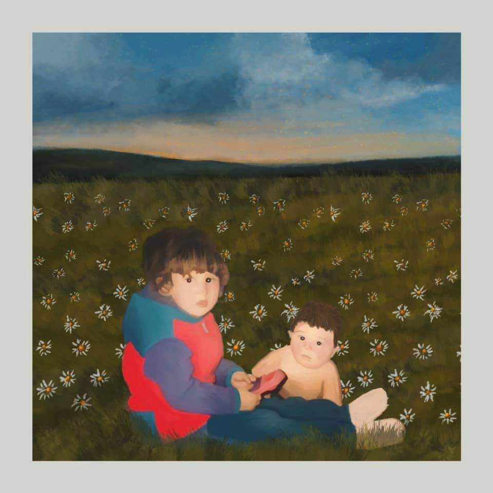
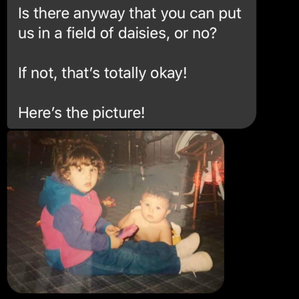
Throughout my life, I've noticed that whenever I meet someone and hit it off right away, invariably they turn out to be a fellow Taurus. Have you noticed anything like that? Do you put much stock into astrology and zodiac sign compatibility? Tell me! Tell me! I held a custom illustration giveaway contest on social media (if you aren't following me on Instagram & Facebook--get on that!) Mandy won and she asked for an illustration of her brother and her as kids in a field of daisies--because daisies are her Mom's favorite flowers and a "field of daisies" is her Mom's happy place. She wanted to gift her Mother with the illustration for her birthday. I loved this idea. I planned on working on this project today and tomorrow, but a bout of insomnia had me crack it out last night (less than a day turnaround time!). I used the photo she sent and found some reference photos for the field of daisies. Next, I put the images together in Procreate on my iPad and got the proportions how I wanted. Then, I started drawing. I love how it turned out! And hopefully Mandy's Mom does too! *fingers crossed* If you are interested in ordering a custom illustration, shoot me an email at DesigningIndie (at) gmail (dot) com
|
AuthorI'm Andie Bottrell, a multidisciplinary creative based in Springfield, MO. This blog is designed to give you an inside peak into the process behind my projects and to share my work. Categories
All
|







 RSS Feed