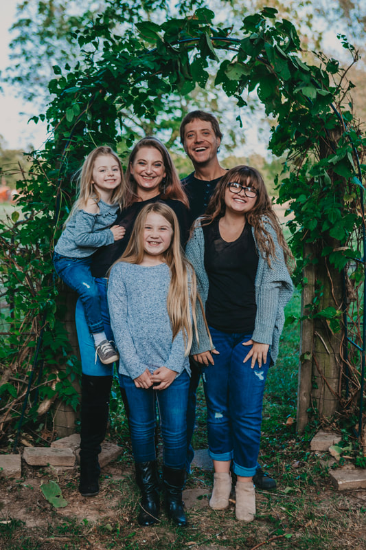
 This was one of the most fun family/porch sessions I've ever done. Not only is this family absolutely gorgeous, but they are hilarious, loving, and have the best yard with tons of places to take really pretty photos. A photographer's dream! The girls had lots of ideas for photos, like this one of Momma and daughters laying on the ground... Love it! 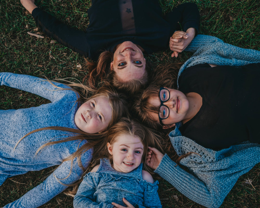 Getting your photo taken while being pushed on a tire swing sure beats your usual school photo day! Due to the pandemic, the girls are going to school virtually this year so this Porch Portrait session doubled and tripled as a family photo session and school photos for each of the girls. 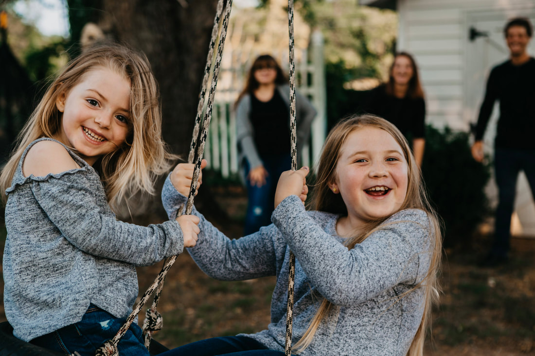 Plus, some super romantic golden-hour shots for mom and dad too. They deserve it! 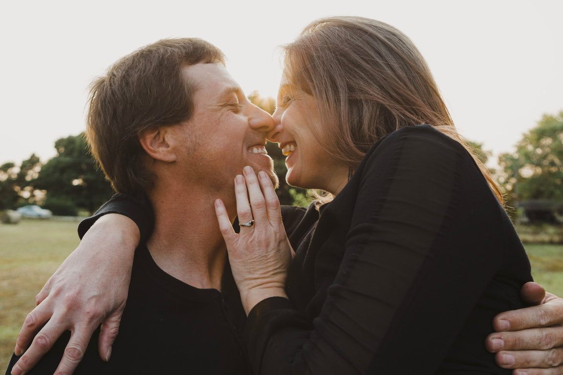 Scroll through for some of my favorites from the shoot below to see how fun and fabulous this family is! There's some bonus shots of their gorgeous pup and cat too! If you're interested in getting photos of your kids taken this year from the comfort and safety of your own home/front or back yard... shoot me a message! When kids can play and pose on their home turf, you can get so much more of their personality to come out in the photos. Also, the holidays are coming up soon and I'd love to create some more family photos and holiday cards! 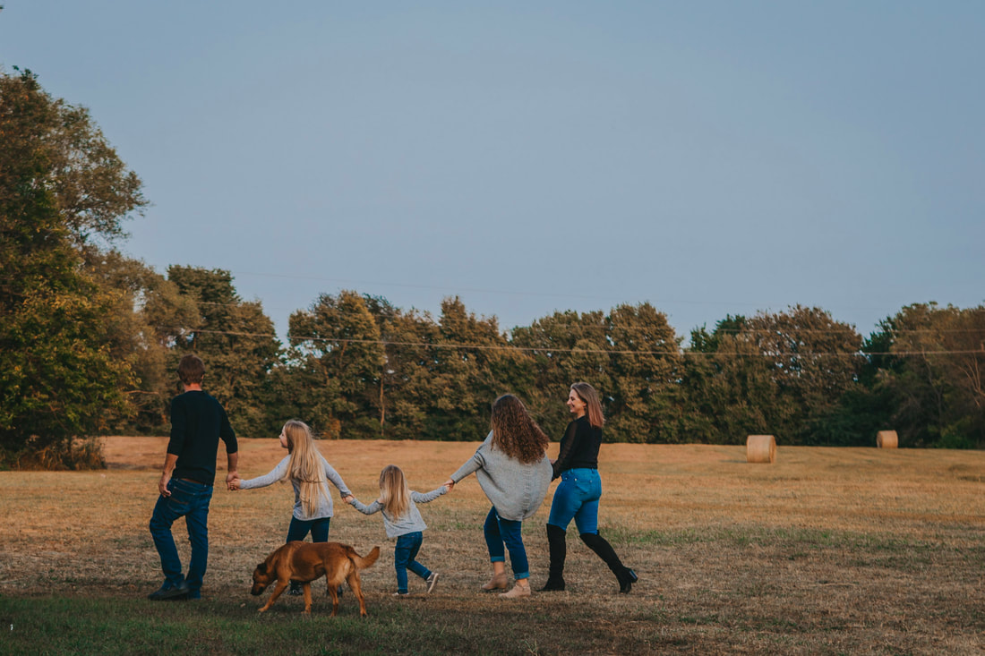
1 Comment
When I was in my early twenties, I lived in Los Angeles and was working as a background actor in movies and TV shows. On one of those sets is where I first heard my friend Anthony casually and with great authority break down the various zodiac signs and guess with great accuracy our signs. I was fascinated. I didn't "believe" any of it, but I enjoyed it with a speculative interest. Over the years, I pretty much stayed in that state of quiet curiosity, checking my horoscope periodically for a laugh.
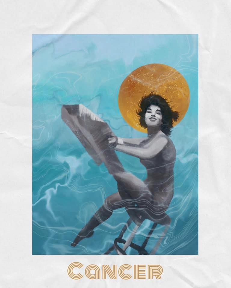
Then, a few years ago, I started checking the romantic compatibility between signs for people I dated, and people who friends were dating and I started to notice a lot of accuracy. My girlfriend and I are Cancer and Taurus respectively and everything I've read about the match between these two signs is exactly, for us, right on. We are extremely compatible. A great match. And my previous relationships (before I was checking astrology compatibility) ended up ending due to exactly the kinds of issues astrology says those two signs matched up would have. It's crazy! And hey, I still take it all with a large grain of salt, and I'm not going to make any decisions based solely off astrology, but I do enjoy it as a fun lens to look at things through and a perspective to consider.
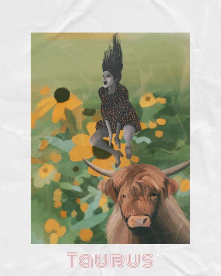
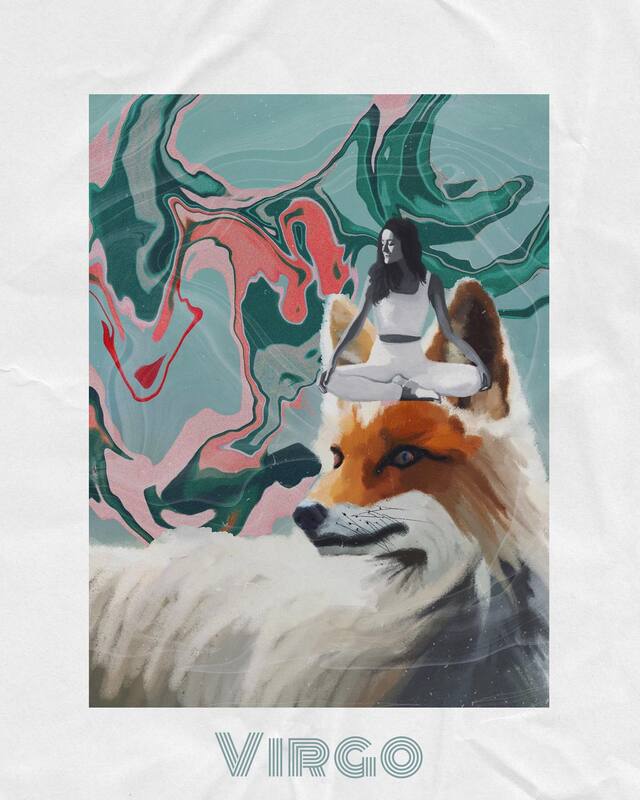
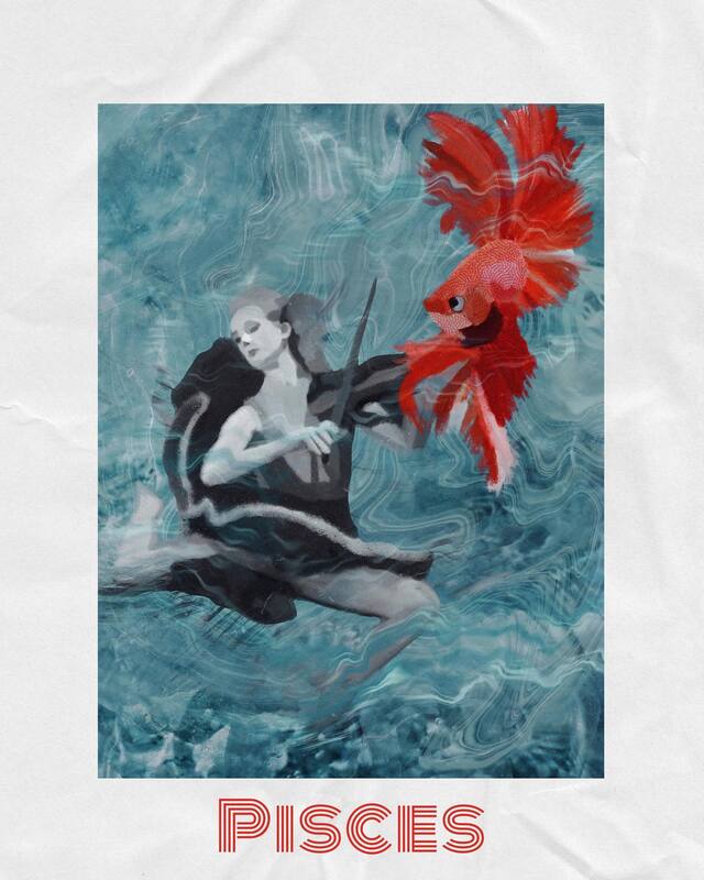
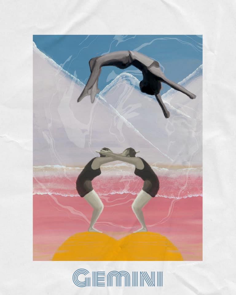
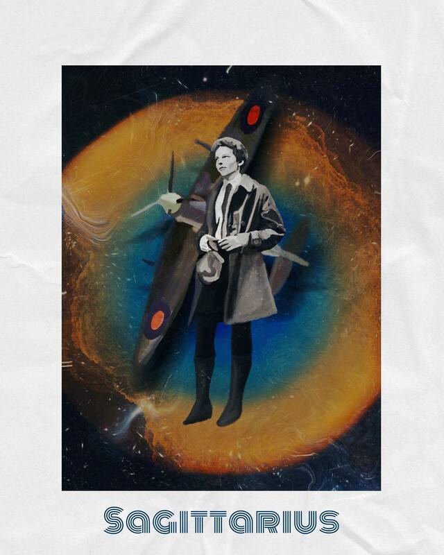
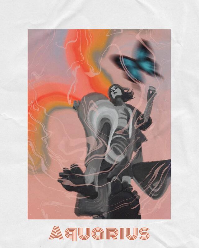
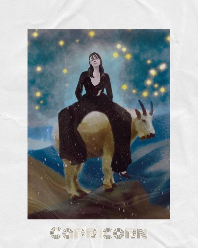
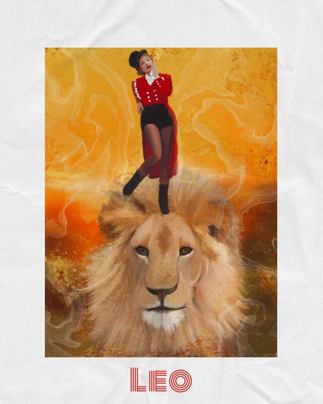
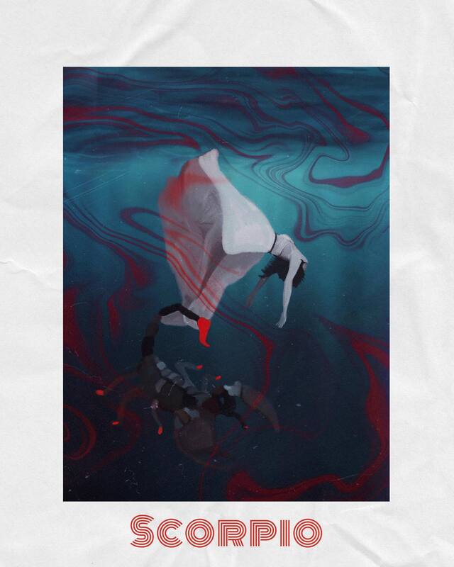
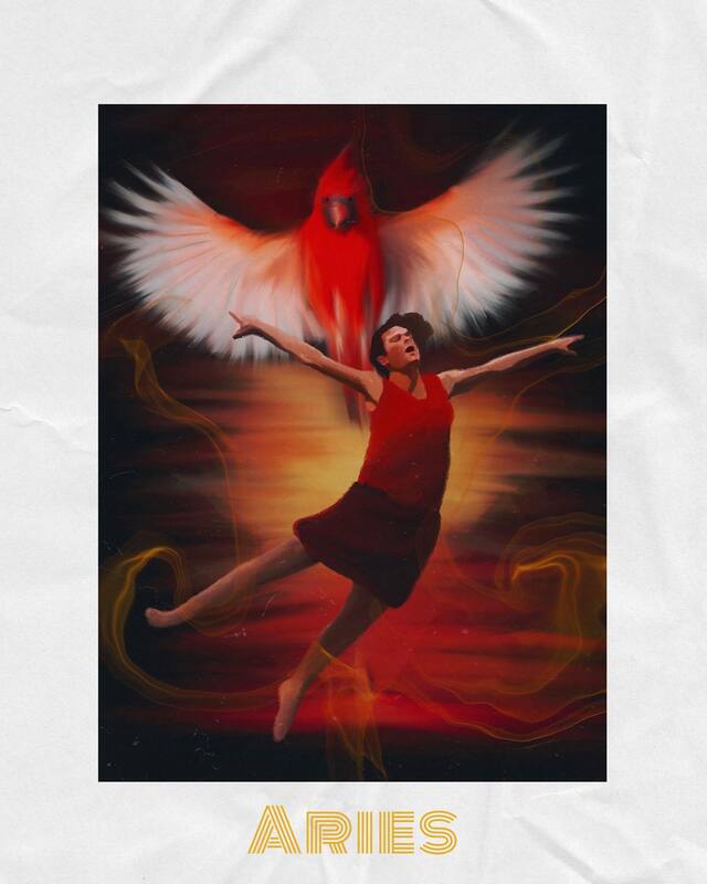
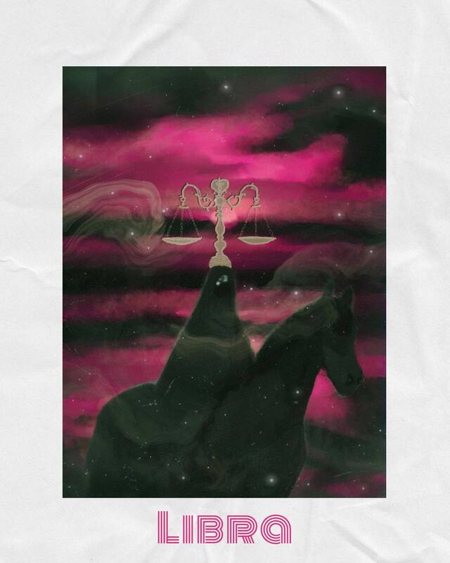
I've been wanting to do a zodiac sign illustration series for a while now. To create these, I pulled up information about each sign and then took a couple different aspects of each description and sourced some images to put together to create my scene and then illustrated it. I use ProCreate to illustrate and I love all the different layers you can use and the variety of brushes available. Then, I used the Template app to add the border and text.
I hope you enjoy them as much as I enjoyed making them! Which one is your favorite? As it so happens, I'm about to do another project for a client related to astrology.... stay tuned! It's gonna be a fun one!
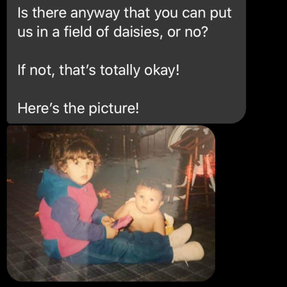
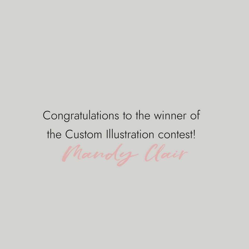
Throughout my life, I've noticed that whenever I meet someone and hit it off right away, invariably they turn out to be a fellow Taurus. Have you noticed anything like that? Do you put much stock into astrology and zodiac sign compatibility? Tell me! Tell me! 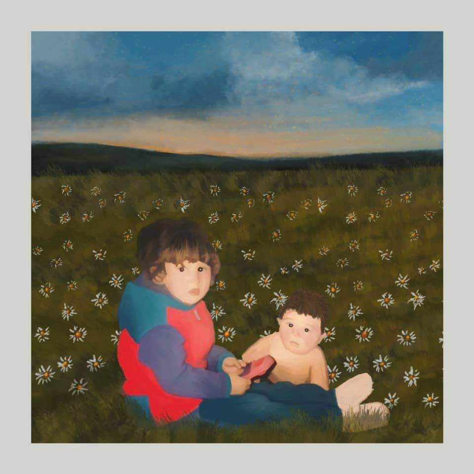 I held a custom illustration giveaway contest on social media (if you aren't following me on Instagram & Facebook--get on that!) Mandy won and she asked for an illustration of her brother and her as kids in a field of daisies--because daisies are her Mom's favorite flowers and a "field of daisies" is her Mom's happy place. She wanted to gift her Mother with the illustration for her birthday. I loved this idea. I planned on working on this project today and tomorrow, but a bout of insomnia had me crack it out last night (less than a day turnaround time!). I used the photo she sent and found some reference photos for the field of daisies. Next, I put the images together in Procreate on my iPad and got the proportions how I wanted. Then, I started drawing. I love how it turned out! And hopefully Mandy's Mom does too! *fingers crossed*
If you are interested in ordering a custom illustration, shoot me an email at DesigningIndie (at) gmail (dot) com
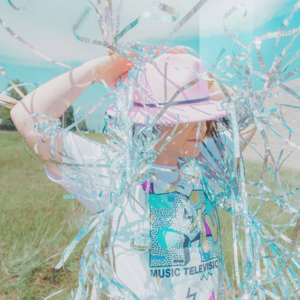
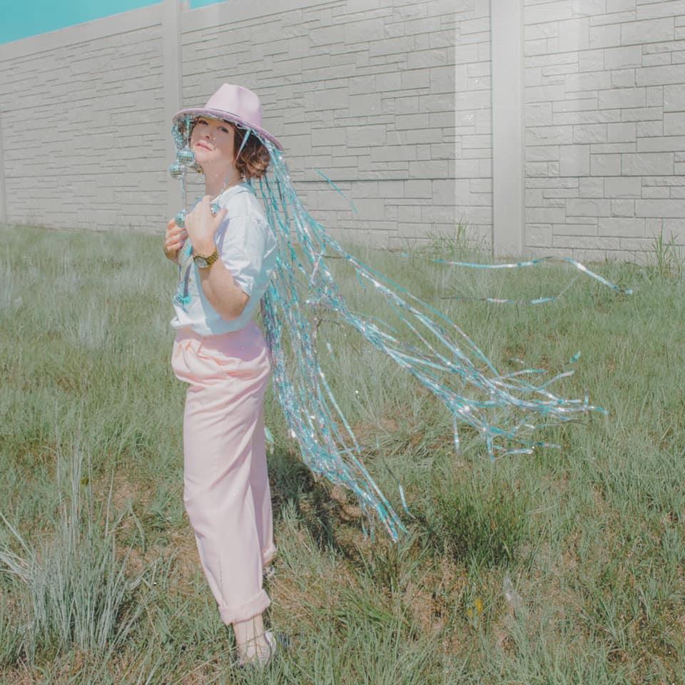
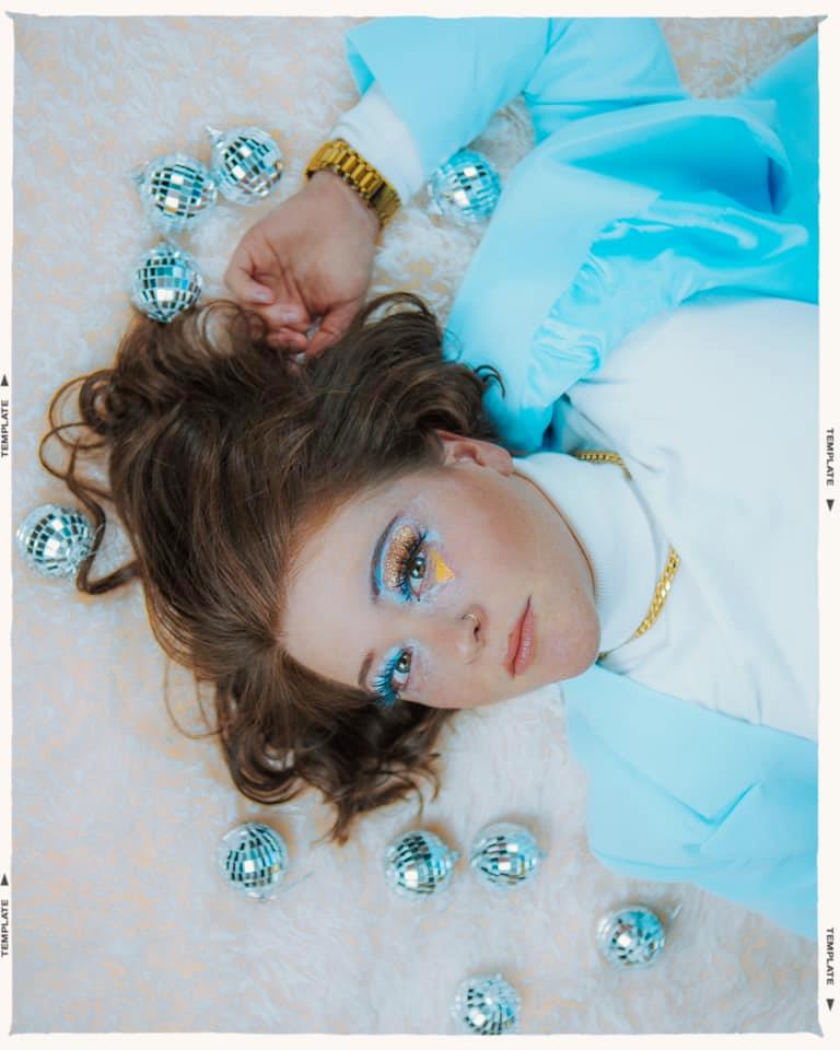
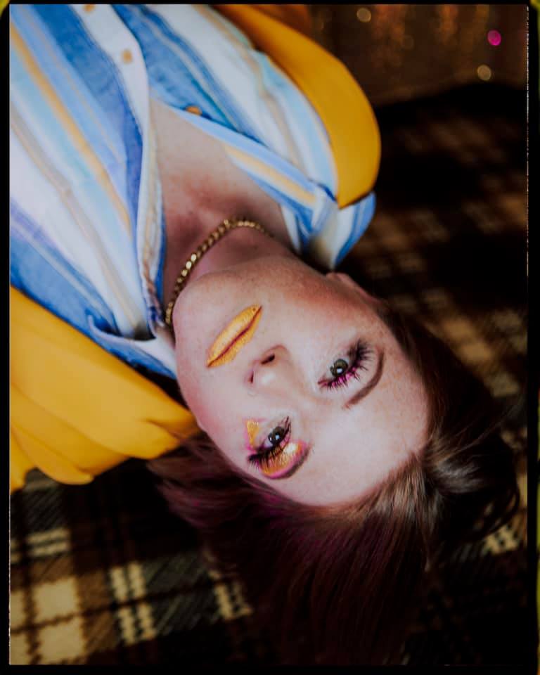
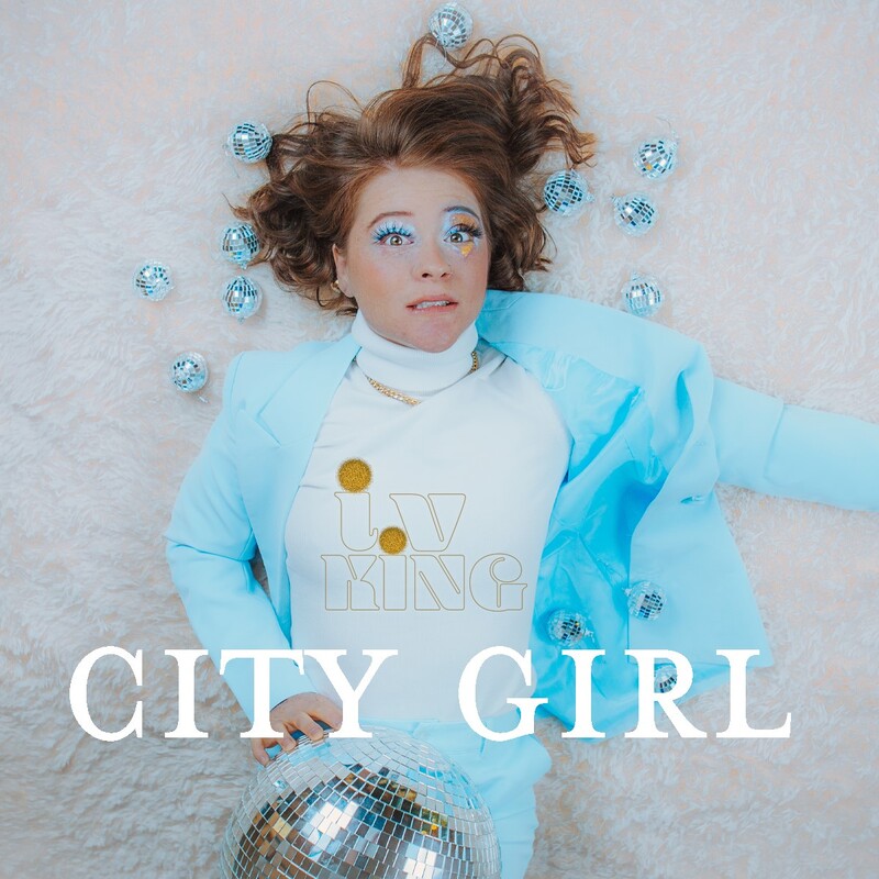 This was such a fun project! I created some promo photos for Ivy a few years ago and was super excited to work with her again. She was working on creating her new brand as a solo artist and getting ready to release her first song, "City Girl." She needed a logo design, some promo photos to use to promote upcoming shows, an album cover design, and a stylist for her upcoming music video. And, get this, when I asked her what her aesthetic vision was for this, she said a mix of 70's & 90's! Talk about a dream job! Plus, I LOVE her music! 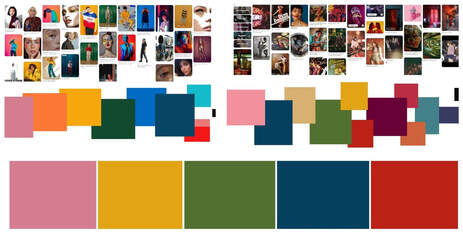 Ivy had already created a pinterest board with some inspiration for the direction she wanted to take. To give us a color palette that we could use to make sure everything tied together, I went through all the photos and created color swatches of the most commonly used colors. As you'll see below, we used a couple of the colors and didn't use others as we found what worked best for this project. Then, I created an online wishlist of possible wardrobe and props which we could both add to and edit as we narrowed down the looks. While doing this, I got started on her logo design. She had a rough idea of what she wanted (small "i" with a dot and a v--maybe a glittery disco ball). When we started it was just going to be "i.V" but after I sent over the few two rounds of logo designs and she decided which two she liked best... I got a text saying she was going to change her name to i.V KiNG. I love her reasoning for it--for one, is more memorable and distinct. Also, her wife had taken her name when they got married, so she wanted to take her wife's name artistically. Such an awesome idea! And thus, queer royalty was born: i.V KiNG! I did a few different redesigns with this adjustment and we landed on the logo above. I love how it turned out. 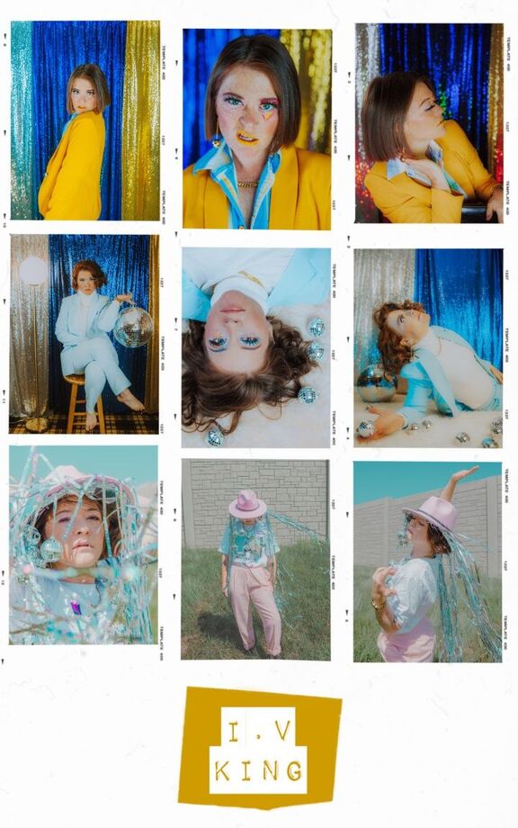 We did three different looks for this so she would have plenty of images to choose from for all the things she was promoting in the upcoming year. We knew we wanted a more dressed up look with fun, vibrant make-up and lots of 70's disco vibes, as well as a more casual, natural look with fun, chill 90's vibes.
I made this "disco hat" with hot-glued on mini disco balls and lots of sparkly tinsel... I am super happy with how it turned out and even more with how magically it photographed in the wind. Fun, right?
The other two looks were more dressed up with fun geometric make-up. Also, you should know Ivy was talking about hard boiled eggs this entire shoot (if you know, you know) and there were lots of disco dance breaks between wardrobe, hair and make-up changes. Then, I started working on the album cover design. She initially wanted a mix of photo and illustration... after working on it, I ended up doing some that were just photo and some that were just illustrated. Below were some of the options I sent her... I love so many of them! 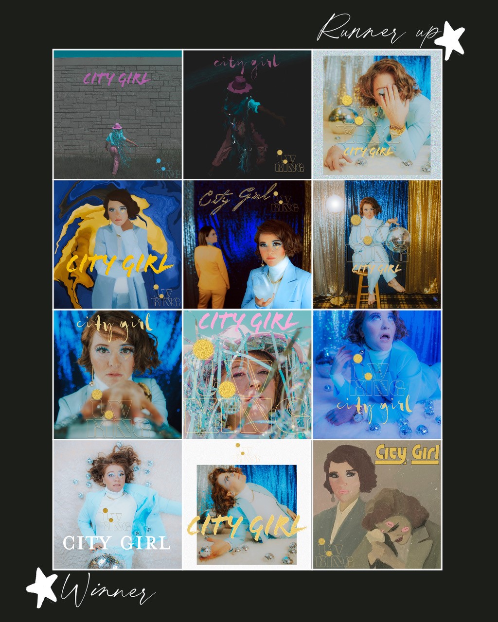 I loved this project! Now, hurry and go pre-save i.V KiNG's single "City Girl" out September 18th, 2020 ---> www.ivkingmusic.com/
|
AuthorI'm Andie Bottrell, a multidisciplinary creative based in Springfield, MO. This blog is designed to give you an inside peak into the process behind my projects and to share my work. Categories
All
|
 RSS Feed
Proudly powered by Weebly